
Fashion Color Pairing Tips for Makeup Coordination
The New Language of Color in Fashion and Beauty
Wow ok so color has become one of the most powerful tools for self-expression across fashion and beauty, and nowhere is this more evident than in the way style-conscious consumers coordinate their outfits with their makeup. As global fashion and beauty markets mature and digital platforms accelerate trend cycles, the relationship between clothing color and cosmetic choices has evolved from simple matching to a more nuanced, strategic form of visual storytelling that blends aesthetics, psychology, and cultural awareness. For the bright and fashion thinking hot audience of BeautyTipa and its growing fans, understanding how to pair fashion colors with makeup is now a key element of building a personal brand, enhancing professional presence, and navigating social and digital spaces with confidence.
Color coordination is no longer just about avoiding clashing shades; it is about creating harmonious narratives that align with personal values, lifestyle, and even regional expectations. From the bold, experimental looks emerging from South Korea and Japan to the understated elegance favored in France, Germany, and the Nordic countries, consumers are increasingly looking for structured, expert-backed guidance that bridges fashion, beauty, and wellness. On BeautyTipa, trend following readers exploring beauty and aesthetics are seeking not only inspiration, but also frameworks that help them translate runway trends, celebrity looks, and social media aesthetics into wearable, workplace-appropriate, and occasion-specific combinations that feel authentic and polished.
In this context, color pairing between clothing and makeup is becoming a strategic capability rather than a casual afterthought, and those who understand its principles are better positioned to make confident choices, streamline their routines, and invest more intelligently in products that truly work together.
Foundations of Color Theory for Fashion and Makeup
Any serious approach to fashion-makeup coordination begins with a clear understanding of color theory, because the same principles that guide interior design and graphic branding also determine whether an outfit and a makeup look will appear harmonious or discordant in real life and on camera. The color wheel, which organizes hues into primary, secondary, and tertiary colors, remains the backbone of this understanding, and modern resources from institutions such as Pantone help professionals and enthusiasts alike interpret seasonal color narratives and broader cultural shifts in color preference. Those who want to explore how global color trends are defined can review the work of Pantone Color Institute and learn more about color standards in design and fashion.
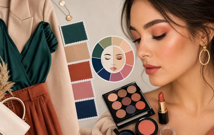
In practical terms, fashion and beauty coordination often relies on three key schemes: monochromatic (different tones of the same hue), analogous (neighboring colors on the wheel), and complementary (opposite colors). Monochromatic looks, such as pairing a deep burgundy dress with wine-toned lipstick and a soft rose blush, are especially popular in the United States and United Kingdom for professional environments because they communicate cohesion and restraint. Analogous combinations, for example teal clothing with blue-green eyeliner and soft gold highlighter, are widely favored in trend-forward markets such as South Korea and Singapore, where subtle but visible complexity is prized. Complementary pairings, like emerald green clothing with warm copper or terracotta eyeshadow, draw on contrast to create dynamic impact and are frequently seen in editorial looks from brands like Dior and MAC Cosmetics, as showcased in publications such as Vogue and Allure, where readers can explore editorial beauty color stories.
Understanding undertones is equally crucial. Skin, clothing, and makeup all carry warm, cool, or neutral undertones that determine how well they interact. A cool-toned navy suit in London or Berlin will usually pair best with cool pink or berry lip colors and taupe or gray-based eyeshadows, while a warm camel coat in New York or Toronto may be better balanced with peachy blush, golden highlighter, and warm brown eyeshadow. On BeautyTipa, readers exploring skincare fundamentals are increasingly aware that undertone analysis goes hand in hand with skin health and complexion management, as the right color choices can visually correct redness, sallowness, or dullness without heavy coverage.
Color theory, therefore, becomes a bridge between fashion and makeup that allows individuals to make deliberate, informed decisions rather than rely on trial and error. This is particularly important for professionals, entrepreneurs, and content creators who must maintain a consistent visual identity across live events, video calls, and social media content in markets from North America to Asia and Europe.
Coordinating Makeup with Neutrals, Pastels, and Bold Tones
Modern wardrobes are built around three broad families of color-neutrals, pastels, and bold or saturated tones-and each category calls for a different strategy when coordinating makeup. Neutrals, including black, white, gray, navy, beige, and taupe, dominate business and smart-casual dress codes in cities such as New York, London, Frankfurt, Zurich, and Singapore, and they offer the greatest flexibility in makeup pairing. A charcoal suit or black dress, for instance, can be elevated with a classic red lip inspired by heritage brands such as Chanel and Guerlain, or softened with nude tones in the style often highlighted by Bobbi Brown. Those interested in how classic beauty houses approach timeless color combinations can explore heritage beauty philosophy.
When outfits lean heavily neutral, makeup can either provide the focal point or maintain a minimal, polished balance. In Canada and Australia, where relaxed professional dress codes meet a strong outdoors culture, many consumers favor a "quiet luxury" approach: subtle contouring, neutral eyes, and a single accent-often a berry lip or a touch of metallic on the eyes-to keep the look modern without appearing overdone. On BeautyTipa, readers who want to refine their daily makeup and beauty routines are increasingly combining capsule wardrobes of neutral clothing with versatile, multi-use makeup products that support this understated sophistication.
Pastels, which cyclically dominate spring and resort collections from Italy, France, and Spain, require a more delicate hand in makeup. Soft lavender dresses, powder blue blazers, and blush-pink blouses can easily be overwhelmed by heavy contouring or overly saturated lip colors. Instead, pastel fashion tends to pair best with luminous, skin-focused makeup that emphasizes hydration, light reflection, and subtle definition, a direction strongly supported by dermatological research and the growing emphasis on skin health. Those interested in the science behind luminous, healthy-looking skin can review guidance from the American Academy of Dermatology.
Bold tones-crimson, fuchsia, emerald, cobalt, and saturated citrus shades-are where coordination becomes both challenging and creatively rewarding. In markets such as Brazil, South Africa, and Thailand, where color-rich fashion is more deeply embedded in cultural expression, consumers are increasingly skilled at balancing vivid clothing with either equally bold or strategically muted makeup. A cobalt suit might be paired with a neutral eye and a rose lip for a business meeting, but the same outfit could be transformed for evening with electric blue eyeliner or a metallic silver shadow. For readers of BeautyTipa exploring brands and products, this means investing in a curated collection of statement shades-vivid liners, bold lipsticks, and reflective shadows-that can be rotated depending on the intensity and temperature of the outfit.
Regional Color Preferences and Cultural Nuances
Color pairing in fashion and makeup is not only a matter of personal taste; it is also shaped by regional sensibilities, cultural norms, and even climate, all of which influence how certain color combinations are perceived in different parts of the world. In the United States and United Kingdom, professional environments often reward understated, neutral-based palettes where makeup is designed to enhance rather than dominate; in these contexts, navy, charcoal, and black clothing is frequently paired with taupe eyeshadow, soft eyeliner, and lips in rose or muted berry tones. In contrast, in Italy, Spain, and parts of Latin America, there is often more cultural acceptance of saturated color in both clothing and beauty, especially in social and evening contexts, where red lips and bronzed skin remain enduring favorites.
In South Korea and Japan, the influence of K-beauty and J-beauty has led to an emphasis on gradient lips, glass-like skin, and creative use of pastel or neon accents that echo the colors found in contemporary streetwear and pop culture. Consumers in these markets are highly responsive to seasonal collections from brands such as Etude, Shu Uemura, and 3CE, and regularly experiment with monochromatic looks that pair, for example, a peach-toned blouse with matching blush and lip tints. Those interested in how East Asian beauty aesthetics are reshaping global color narratives can explore regional beauty insights.
Northern European countries such as Sweden, Norway, Denmark, and Finland tend to favor minimalist aesthetics, where clothing often leans towards black, white, gray, and muted earth tones, and makeup is subtle, skin-centric, and highly functional. In these markets, the most successful color pairings are often those that respect natural light conditions and seasonal changes, with slightly deeper, cozier tones in winter and fresher, lighter hues in summer. In China and Singapore, rapid urbanization and digitalization have created hybrid aesthetics that blend luxury fashion, streetwear, and high-performance skincare, leading to sophisticated color pairings where bold designer pieces from houses such as Louis Vuitton or Gucci are balanced with carefully calibrated makeup that photographs well on high-resolution smartphone cameras. Professionals seeking to understand how global cultural factors influence beauty preferences can review consumer insights from McKinsey's beauty industry reports.
For BeautyTipa, whose audience spans North America, Europe, Asia, Africa, and South America, acknowledging these regional nuances is essential. Articles, guides, and visual references on global trends can help readers adapt general color-pairing principles to their local context, whether that means toning down contrast for conservative workplaces in Germany or embracing jewel-toned eyeshadows to complement traditional attire in South Africa or Malaysia.
The Role of Skin Tone, Undertone, and Texture
While clothing color sets the stage, skin tone and undertone determine how both fashion and makeup shades will ultimately appear, making complexion analysis a core competency for anyone who wants to coordinate colors effectively. Light, medium, tan, deep, and rich skin tones each interact differently with pigments, and variations in warmth, coolness, and neutrality can shift how a color is perceived. For example, a classic red lipstick that appears balanced on a neutral medium skin tone may pull orange on a warm undertone or pink on a cool undertone, which in turn affects how it harmonizes with a crimson dress or a burgundy blazer.
Advances in dermatology and cosmetic chemistry over the past decade have improved the quality and inclusivity of color cosmetics, particularly foundation and concealer ranges, enabling better matches for diverse skin tones in countries such as the United States, Canada, Brazil, South Africa, and India. Those interested in the science of color cosmetics and skin interaction can explore dermatological perspectives. As complexion products become more accurate, consumers can focus more on strategic color pairing rather than compensating for mismatched base makeup.
Texture also plays a crucial role. Matte fabrics and matte makeup create a more formal, structured impression, while satin, shimmer, and gloss introduce movement and light play. A matte black suit, for instance, is well complemented by a semi-matte lip and softly diffused eyeshadow, whereas a silk emerald blouse or sequined dress can be balanced with dewy skin and a glossy lip to avoid visual heaviness. On BeautyTipa, where readers explore wellness-focused skincare, there is growing recognition that healthy skin texture-achieved through consistent routines, sun protection, and appropriate treatments-forms the foundation for any successful color pairing, because colors appear more vibrant and flattering on well-cared-for skin.
Professionals in fields such as finance, law, and technology are increasingly aware that subtle adjustments in makeup color and texture can influence perceptions of credibility and approachability. For example, soft matte finishes and neutral color pairings are often recommended for high-stakes presentations or board meetings, while slightly more luminous textures and bolder color accents may be appropriate for networking events, creative industries, or fashion and beauty conferences. Those seeking to understand how appearance impacts professional outcomes can review research on first impressions and nonverbal communication.
Event, Season, and Lighting: Context-Driven Coordination
Color pairing between fashion and makeup cannot be separated from context, and sophisticated coordination always considers event type, season, and lighting conditions. A look that appears balanced in natural daylight may become washed out or overly intense under office fluorescents or warm evening lighting, which is why industry professionals frequently test their color choices in multiple environments before finalizing them. For readers of BeautyTipa who attend industry events, fashion weeks, and beauty expos, understanding how context shifts perception is especially valuable.
For daytime business meetings in New York, London, or Frankfurt, a navy or gray suit paired with neutral eye makeup, soft blush, and a medium-intensity lip color is often the most reliable choice, as it reads as professional both in person and on video calls. In contrast, evening events in Paris, Milan, or Barcelona allow for deeper tones and more pronounced contrast, such as a black dress with a bold red or plum lip and a subtly smoky eye. Seasonal considerations further refine these decisions; spring and summer often favor lighter, fresher palettes-think coral lips with white or pastel outfits-while autumn and winter invite richer, more grounded tones like burgundy, forest green, and bronze.
Lighting is particularly critical for those who create content for digital platforms such as Instagram, TikTok, and YouTube, where ring lights and studio setups can alter how colors appear. Many content creators now test their outfits and makeup under both warm and cool artificial lighting to ensure that color pairings remain flattering on camera. Professionals who want to understand how different light spectra influence color perception can review educational resources on lighting and color rendering. For the BeautyTipa audience, which includes aspiring makeup artists, stylists, and beauty entrepreneurs, this knowledge translates directly into better portfolio images, more cohesive branding, and more effective client communication.
Technology, AI, and Data-Driven Color Coordination
By 2026, technology has become an integral part of how consumers and professionals approach color pairing in fashion and makeup. Augmented reality (AR) try-on tools, AI-powered recommendation engines, and advanced color-matching algorithms now allow users to preview how specific lipsticks, eyeshadows, and blushes will look with particular outfits, skin tones, and lighting conditions before making a purchase. Major beauty retailers and brands such as Sephora, L'Oréal, and Estée Lauder have invested heavily in these capabilities, while independent developers and startups continue to refine tools that analyze user-uploaded photos and suggest optimized combinations. Those interested in the technological underpinnings of these solutions can learn more about AI in the beauty industry.
For BeautyTipa, whose readers follow technology in beauty and fashion, this convergence of data and aesthetics represents a significant opportunity. Personalized recommendations based on wardrobe color profiles, skin tone analysis, and preference histories can help users build more coherent, sustainable collections of both clothing and cosmetics. Instead of purchasing multiple similar items that do not coordinate well, consumers can invest in fewer, more strategic pieces that support a broad range of looks. This aligns with broader sustainability goals in the fashion and beauty sectors, where organizations such as the Ellen MacArthur Foundation advocate for circularity and more responsible consumption; those who wish to learn more about sustainable business practices can explore their work.
AI-driven tools are also beginning to account for cultural and regional preferences, suggesting different intensity levels or finishes for users in Japan versus Brazil, for example, and adjusting recommendations based on local climate, daylight patterns, and prevailing dress codes. For beauty professionals and job seekers visiting BeautyTipa's great jobs and employment section, familiarity with these technologies is increasingly a competitive advantage, as brands and retailers look for staff who can bridge the gap between human creativity and data-driven personalization.
Strategic Investment and Brand Positioning Through Color
From a business and finance perspective, color coordination between fashion and makeup is not only an aesthetic concern; it is also a strategic lever that influences product development, merchandising, marketing, and brand positioning. Companies that understand how consumers pair clothing and cosmetics can design more cohesive collections, bundle products more effectively, and create content that resonates across multiple platforms and regions. For example, a fashion label might collaborate with a beauty brand to release a capsule collection where every garment is accompanied by a curated set of lip, eye, and cheek products designed to complement its color palette. Professionals interested in the economic drivers behind these collaborations can explore industry analyses on beauty-fashion partnerships.
For website readers of BeautyTipa who explore business and finance insights, understanding these dynamics can inform career decisions, entrepreneurial ventures, and investment strategies. Color-savvy consumers are more likely to respond to marketing that demonstrates real-world coordination-campaigns that show a blazer, lipstick, and eyeshadow working together in a believable context rather than isolated product shots. Brands that consistently present coherent color stories across seasons and channels build stronger visual identities, which in turn support higher brand recall and loyalty.
At the individual level, professionals and creators who master color pairing can position themselves as authorities in their fields, whether they are stylists, makeup artists, influencers, or consultants. Their ability to translate runway trends, cultural references, and technological tools into practical, personalized advice for clients and audiences becomes a key differentiator. For BeautyTipa, offering daily in-depth guides and tips on fashion-makeup coordination across regions-from North America and Europe to Asia, Africa, and South America-reinforces the platform's role as a trusted resource for both consumers and professionals.
Integrating Fashion, Beauty, and Lifestyle on BeautyTipa
Ultimately, fashion color pairing and makeup coordination in 2026 reflect a broader integration of beauty, wellness, lifestyle, and identity. Consumers are increasingly aware that their choices in clothing, cosmetics, skincare, nutrition, and fitness are interconnected, influencing not only how they look but also how they feel and how they are perceived in both personal and professional contexts. On BeautyTipa, where sections on health and fitness, food and nutrition, and fashion sit alongside beauty-focused content, this holistic perspective is central.
Color pairing becomes one thread in a larger tapestry of self-care and self-presentation. A well-rested, well-nourished individual with a consistent skincare routine will find that colors appear more flattering and require less corrective makeup, while thoughtful wardrobe planning can reduce decision fatigue and support a more streamlined, sustainable lifestyle. International jet setting readers-from the United States and Canada to France, Italy, Spain, and others-can all adapt these principles to their local realities, cultural expectations, and climate conditions, building personal color strategies that evolve with their careers, life stages, and aspirations.
As fashion and beauty continue to converge, and as digital tools make sophisticated color theory accessible to a wider audience, the ability to coordinate clothing and makeup with intention will only grow in importance. For the fashion and beauty super active community of BeautyTipa, this is an invitation to move beyond trend-chasing towards a more informed, confident, and globally aware approach to style-one where every shade chosen, from blazer to lipstick, contributes to a coherent narrative of who they are and how they choose to appear in the world. Readers can continue exploring this journey across the full BeautyTipa platform, starting from the homepage, and deepening their expertise in beauty, wellness, fashion, and beyond.
