
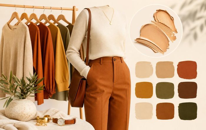
Everyday Outfit Colors That Complement Warm Undertones
Choosing clothes in the right colors can make skin look clearer, eyes brighter, and features more defined without changing anything about hair or makeup. For people with warm undertones, some shades will naturally harmonize with their coloring, while others can make them look tired or washed out, even if the clothes themselves are beautiful. Understanding why this happens, and how to use color intentionally, makes putting together everyday outfits faster and more intuitive.
This guide focuses on warm undertones and how to build a wearable, repeatable color wardrobe-whether someone prefers minimalist basics, soft neutrals, or bold, saturated looks. It brings together color theory, practical styling tips, and current fashion approaches so that choosing flattering shades becomes a habit rather than guesswork.
How to Tell If You Have Warm Undertones
Before choosing outfit colors, it helps to confirm undertone. Skin tone (light, medium, deep) is about depth; undertone (warm, cool, neutral) is about the subtle color beneath the surface. Undertone does not change with tanning or fading, although overall depth might.
Dermatologists and makeup artists commonly use a few simple indicators, none of which are perfect alone, but together give a good picture:
Vein test: If veins on the underside of the wrist appear more green than blue, that often indicates warm undertones. Blue or purple-leaning veins tend to suggest cool undertones, while a mix can signal neutral. The American Academy of Dermatology notes that undertone is a key factor in choosing foundation shades and often uses similar cues in clinical guidance on skin tone and sun protection.
Jewelry test: If gold jewelry tends to look more "right" or flattering than silver, that usually aligns with warm undertones. People with cool undertones often find silver more harmonious, while neutrals can wear both easily.
White vs off-white: Holding a bright white fabric next to the face can be revealing. Warm undertones often look healthier beside creamy white or ivory, whereas stark white may emphasize redness or sallowness.
Natural tanning pattern: While not definitive, many people with warm undertones tan more easily and may have a golden, olive, or peachy cast to their skin. However, this varies across ethnicities and should be considered alongside other tests.
If several of these indicators point toward warmth, the color guidance below will likely be helpful. For readers who feel they sit between warm and neutral, many of the same shades will still work, especially the softer and earthier tones.
For more on how undertone connects to overall beauty routines, it can be helpful to look at how makeup artists match foundation and concealer to undertones, then echo those principles in clothing choices.
Why Warm Undertones and Certain Colors Work So Well Together
Warm undertones typically have yellow, golden, peach, or olive notes beneath the surface. Color theory explains that when clothing colors share similar warmth, they create visual harmony: the eye reads the face and outfit as cohesive, making skin appear smoother and more radiant. When colors clash with undertone-such as icy pastels or blue-based reds on very warm skin-the contrast can emphasize shadows, texture, or unevenness.
Fashion colorists and stylists often group warm-friendly palettes into "autumn" and "spring" categories within seasonal color analysis. While this system is not scientific, it is based on consistent observations about how people's natural coloring interacts with hue, saturation, and value. Warm undertones usually shine in:
Warm hues: yellows, oranges, warm reds, golden greens, and browns.
Soft whites and creams rather than stark, optic whites.
Earth tones: camel, terracotta, olive, and khaki.
Gold-leaning metallics: yellow gold, bronze, copper.
This does not mean people with warm undertones must avoid cool colors entirely. Instead, they often look best in warmer versions of those shades: teal instead of icy blue, warm charcoal instead of blue-black, tomato red instead of cherry red. The goal is not restriction but refinement-learning which versions of favorite colors feel most natural.
Readers who are also refining their makeup can find it useful to coordinate clothing with warm-toned makeup choices, such as peach blushes, golden highlighters, and warm browns, to reinforce this overall harmony.
Everyday Neutrals That Flatter Warm Undertones
Neutrals make up the backbone of most wardrobes, especially for work, commuting, and low-effort outfits. For warm undertones, the most flattering neutrals usually have a hint of yellow, red, or brown rather than blue or gray. This subtle difference can completely change how polished someone looks in basic pieces like T-shirts, trousers, and coats.
Beige, camel, and tan are classic warm neutrals that almost always flatter warm undertones when chosen carefully. Camel coats, tan trousers, and beige knitwear echo the warmth in the skin and create a soft, luxurious effect. The key is to avoid grayed-out, ashy beiges that lean too cool; instead, look for honey, sand, or caramel descriptors. Many brands and stylists describe these as "warm neutrals" or "golden neutrals," and they tend to pair beautifully with gold jewelry and brown leather accessories.
Cream, ivory, and off-white are also excellent alternatives to stark white. Bright white fabrics are often produced with optical brighteners that give them a bluish cast, which can look harsh on warm undertones. Ivory shirts, ecru denim, or cream sweaters soften facial features and complement warm-based makeup looks. The difference is especially noticeable in close-to-face pieces like blouses, scarves, and turtlenecks.
Warm browns-from light cognac to deep chocolate-are another versatile neutral group. These shades can replace black in many outfits, especially for daytime or casual wear. For example, chocolate trousers with a cream blouse and tan loafers create a cohesive, warm-toned look that works for offices and informal settings alike. Brown leather bags, belts, and boots also tend to look more integrated with warm skin than stark black accessories.
Navy can work well when chosen in warmer, inky versions rather than cool, bright royal blues. A slightly muted navy blazer or jeans can serve as a neutral base, especially when paired with camel, rust, or olive. For readers experimenting with capsule wardrobes or routine-focused dressing, anchoring outfits around a small set of warm neutrals-camel, cream, chocolate, and warm navy-can make daily styling more straightforward.
For more detail on neutrals and skin tones, resources from fashion educators and color consultants, such as guides on building warm-toned capsule wardrobes, can offer visual examples of how these neutrals play out in real outfits.
Warm-Friendly Color Families for Everyday Wear
Once neutrals are in place, accent colors can add personality and variety without undermining the harmony with skin tone. For warm undertones, certain color families consistently feel "at home."
Earth tones are perhaps the most forgiving and wearable group. Olive, khaki, terracotta, rust, burnt orange, mustard, and warm taupe all have a natural, grounded quality that pairs well with denim, leather, and classic basics. These colors echo natural elements like clay, foliage, and wood, which visually make sense alongside golden or olive skin. A rust T-shirt with dark jeans, a mustard cardigan over a cream dress, or olive utility trousers with a beige tee are all examples of simple, low-effort outfits that flatter warm undertones.
Warm reds and corals are particularly striking. Instead of blue-based reds (often labeled cherry, crimson, or berry), look for tomato red, brick, coral, or poppy-shades with more orange than blue. According to color theory used in makeup artistry, orange-based reds tend to brighten warm complexions and teeth, while blue-based reds can emphasize sallowness on very warm skin. The same principle holds for clothing: a coral blouse or brick-red wrap dress can make the face appear more vibrant, especially when paired with warm-toned lipstick. The Pantone Color Institute offers useful visual references of orange-based reds and corals that can help identify similar shades in stores.
Yellows and golds, while sometimes intimidating, can be very flattering when muted slightly. Mustard, marigold, and goldenrod are easier to wear than neon or lemon yellow, which can overpower many undertones. A soft mustard sweater, for example, can look sophisticated with dark denim and tan boots, especially on medium to deep warm skin tones.
Warm greens, particularly olive, moss, chartreuse, and sage, are another everyday-friendly choice. Olive and sage work almost like neutrals and integrate easily into workwear and casual outfits. Chartreuse is bolder, sitting between yellow and green; on warm skin, it can look fashion-forward when used sparingly, such as in a scarf, bag, or knit top.
Warm pinks and peaches-like salmon, apricot, and warm blush-can mimic the natural flush in cheeks, creating a gentle, romantic effect. These are especially flattering in tops, dresses, and scarves that sit close to the face. For those interested in aligning makeup and wardrobe, warm pink clothing pairs nicely with peach-based blush and lip colors, reinforcing the overall warmth.
Making Cool Colors Work on Warm Undertones
Many people with warm undertones still love traditionally "cool" colors like blue, purple, and gray. The goal is not to avoid them entirely but to choose warmer versions or balance them with warmer elements so that they do not overpower the skin.
For blues, teal, turquoise, and warm navy are usually more flattering than icy or powder blues. Teal and turquoise contain green and yellow, which resonate with warm undertones. A teal blouse under a camel blazer or a turquoise summer dress with tan sandals can feel balanced and vibrant. Even classic denim can be chosen in slightly warmer washes-mid-blue with a hint of green or gray, or rich indigo-rather than very bright, cool blue.
Purples are trickier because many lean blue. However, plum, aubergine, and red-violet shades, which contain more red than blue, can look beautiful on warm skin. These deeper purples work especially well in accessories-bags, shoes, scarves-or in prints mixed with warm colors like rust or gold. For more guidance on how color temperature shifts within a hue, color education resources like the Interaction of Color framework from Yale University Press and visual tools such as Adobe Color's temperature sliders can be helpful.
Grays and charcoals can still be part of a warm-toned wardrobe when they lean slightly brown or green rather than blue. Greige (a mix of gray and beige), mushroom, and warm charcoal are more forgiving than cool, icy gray. A warm charcoal coat or greige knit can function as a subtle neutral, especially when combined with camel, cream, or gold jewelry.
When wearing a cooler color near the face, it often helps to add a warm element between the garment and skin. This might be a gold necklace, warm-toned scarf, or even warm makeup-bronzer, peach blush, or a warm lipstick-to bridge the temperature gap. This approach mirrors how stylists use makeup to balance undertones in editorial fashion shoots, and it translates easily into everyday dressing.
Prints, Patterns, and Denim: Everyday Staples for Warm Undertones
Most everyday wardrobes rely heavily on prints and denim, so it is worth considering how undertones interact with these staples.
For prints, the main question is whether the dominant colors in the pattern are warm or cool. Florals, stripes, and checks that feature cream, camel, rust, mustard, olive, and tomato red will generally sit more harmoniously on warm undertones than those dominated by icy pink, bright fuchsia, cool navy, or optic white. When in doubt, look at the background color: a cream or beige base tends to be more forgiving than a stark white one.
Stripes are particularly common in casual outfits. For warm undertones, navy-and-cream, rust-and-ivory, or olive-and-tan stripes usually look softer than black-and-white. Breton-style tops in ecru and navy can be an especially useful everyday piece: they feel classic and easy to style while aligning with warm-friendly palettes.
Denim deserves special attention because jeans and denim jackets are daily essentials for many people. Traditional indigo denim is naturally slightly cool, but washes vary. Mid-wash and dark-wash jeans with a richer, inky tone generally flatter warm undertones more than very bright blue or extremely faded, grayish washes. Ecru or cream denim is another strong option, particularly for spring and summer. Paired with warm-toned casual basics, such as tan sandals and a rust T-shirt, ecru jeans can become a versatile alternative to blue denim.
For those who like colored denim, earthy colors-olive, rust, camel, and chocolate-are particularly effective. These shades pair easily with neutral tops and create tonal outfits that feel intentional without requiring complex styling.
Matching Outfit Colors With Makeup, Hair, and Accessories
Warm undertones do not exist in isolation; they interact with hair color, eye color, and makeup choices. Aligning all of these elements can create a cohesive aesthetic that feels polished even in simple outfits.
Hair color plays a major role in how warm-friendly clothing reads. Golden blondes, honey brunettes, auburn, copper, and rich dark browns with warm highlights all reinforce warm undertones. When clothing echoes these hair colors-camel with honey blonde, rust with copper, chocolate with deep brown-the overall effect is harmonious. Colorists often recommend warm hair tones for warm skin, and resources from professional organizations such as the Professional Beauty Association offer education on matching hair color to skin undertone that aligns with these principles.
Makeup can either soften or sharpen the impact of clothing colors. For instance, if someone with warm undertones chooses to wear a cooler gray sweater, adding warmth back into the face via bronzer, peach blush, or warm brown eyeshadow can prevent the sweater from making the complexion look dull. Conversely, wearing a strong warm color like mustard or tomato red near the face may allow for more minimal makeup, as the clothing itself adds vibrancy. Readers exploring skincare and makeup routines may find it useful to test outfits in natural daylight while adjusting lip and cheek colors to see how the entire look shifts.
Accessories are often the easiest place to lean into warmth. Gold, bronze, and copper jewelry usually flatter warm undertones more than silver or gunmetal. Brown or tan leather belts, bags, and shoes tend to integrate better with warm palettes than stark black, especially in daytime outfits. Scarves in warm prints, hats in camel or rust, and sunglasses with tortoiseshell frames can all act as small but effective warm anchors.
Even beauty-adjacent choices like nail polish can support the overall palette. Warm reds, terracotta, caramel, chocolate, and golden metallics on nails echo the same color story as the clothing, contributing to a cohesive impression without requiring a perfectly matched look.
Building a Warm-Toned Everyday Wardrobe
For everyday dressing, most people benefit from a small set of go-to combinations that can be mixed and matched without much thought. For warm undertones, this often means selecting a foundation of warm neutrals, then layering in a few accent colors that feel both flattering and personally expressive.
A practical approach is to start with a "core four" of warm neutrals that can pair with nearly everything: for example, cream, camel, chocolate, and warm navy. These can be expressed in key wardrobe items like trousers, jeans, jackets, and knitwear. From there, add two or three accent color families, such as rust and terracotta, olive and sage, and warm red or coral. This creates a palette where most pieces naturally work together, reducing decision fatigue.
When shopping, it helps to test colors in natural light and compare similar shades side by side. Holding a camel coat next to a cool gray one, for instance, often makes it immediately obvious which better supports warm undertones. Some stylists recommend taking a quick photo of the face while wearing a new color and comparing it to a photo in a known flattering shade; subtle shifts in brightness or shadow around the eyes and mouth can reveal whether the color is enhancing or detracting.
Readers interested in a more systematic approach can explore capsule wardrobe concepts and color planning tools. Style-focused platforms and educators offer visual guides on creating warm-toned capsule wardrobes that can be adapted to different lifestyles, from office environments to creative fields or casual, home-based routines. Integrating these ideas with personal wellness and daily routines can make getting dressed feel less like a chore and more like a small act of self-care.
For those who enjoy following trends, seasonal fashion reports from sources such as Vogue, Harper's Bazaar, and the Pantone Fashion Color Trend Reports regularly highlight which warm shades-like terracotta, saffron, or olive-are prominent in a given season. Checking these references, such as the Pantone Fashion Color Trend Report, can help identify on-trend warm hues that still align with undertones.
When to Break the "Warm Colors for Warm Undertones" Guideline
Undertone-based color advice is a tool, not a rule. There are many reasons someone with warm undertones might intentionally wear cooler shades: personal preference, cultural dress, work uniforms, or simply mood. The key is understanding how and why certain colors are less naturally flattering, then deciding when that trade-off is acceptable-or how to soften it.
For example, black is often considered challenging for very warm undertones because of its cool, stark quality. Yet black is practical, widely available, and a core element of many dress codes. In these situations, small adjustments can make black more wearable: choosing softer fabrics (like knitwear rather than crisp synthetics), layering black with warm neutrals (a black top under a camel blazer), or adding warm accessories (gold jewelry, a rust scarf) can all help.
Similarly, icy pastels may not be the most flattering alone but can work in prints mixed with warmer colors or placed away from the face-such as pastel sneakers or a bag rather than a high-neck top. The British Fashion Council and other industry groups increasingly emphasize personal expression over strict rules, encouraging wearers to adapt guidelines to individual style.
Ultimately, the most sustainable and satisfying wardrobe is one that balances color theory with personal taste. For many people with warm undertones, understanding which shades naturally support their complexion is less about restriction and more about confidence-knowing that even on rushed mornings, reaching for camel, cream, olive, rust, or warm red will likely result in an outfit that feels and looks right.
For additional guidance on integrating color choices with broader beauty habits-like skincare, makeup, and hair-readers can explore related sections on beauty, fashion, trends, and guides and tips. Over time, these small, consistent choices can turn color from a source of confusion into one of the most reliable tools in everyday style.
